rmicheri
← all work
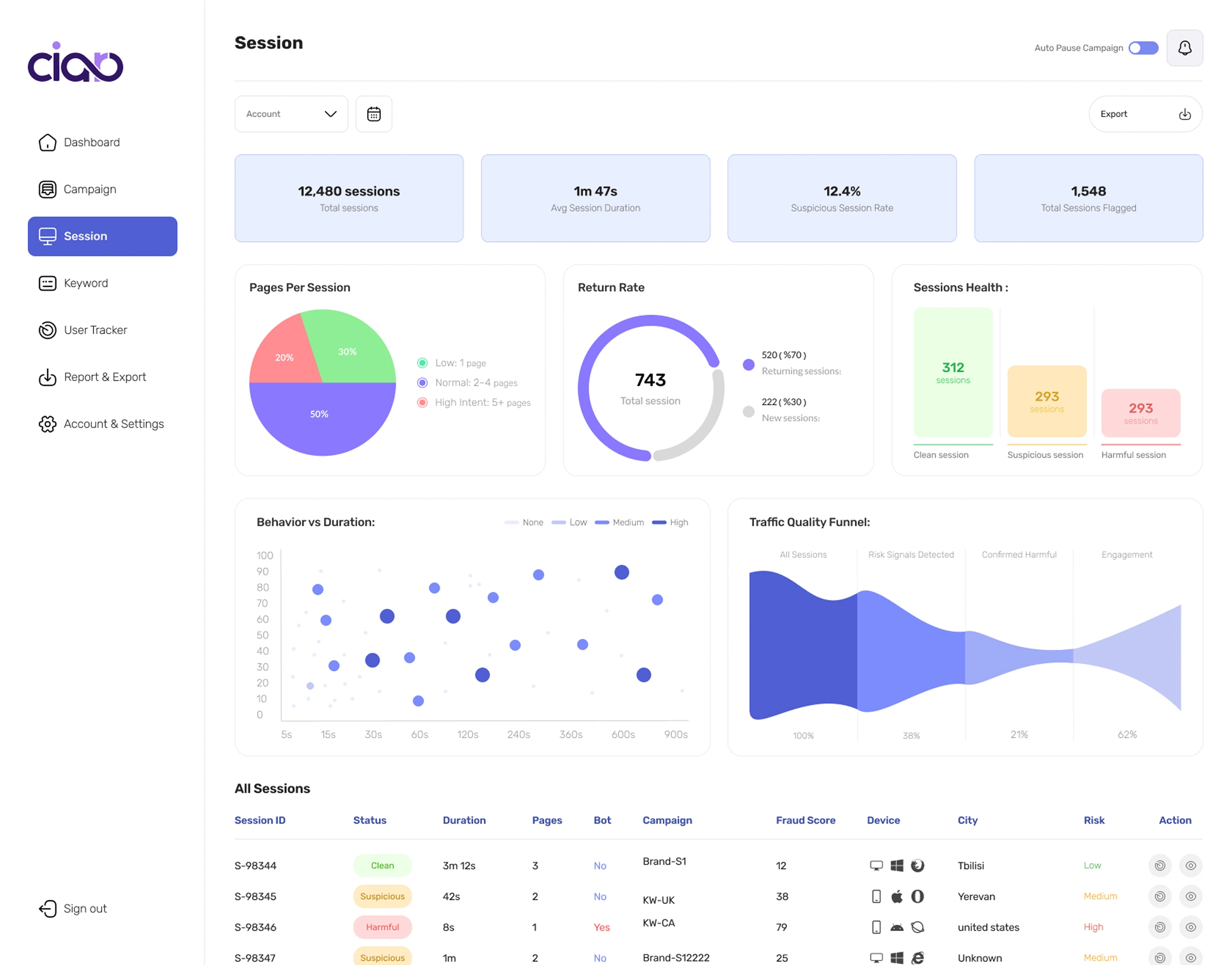
Ciaro analytics dashboard — session KPI cards, pages-per-session and return-rate charts, a session-health breakdown, a behavior-versus-duration scatter, and a traffic-quality funnelARMINTRONMODEL ARM-1 · 14" CRTBCMPWRSN 8842-1991

CRO Platform

Conversion Rate Optimization SaaSLead Product DesignerIn Development

56 active beta users · averaging ~1,000 sessions — protecting Google Ads budgets from fraudulent traffic, showing users exactly why each session was flagged.

Timeline2024–Present
ToolsFigma · Miro · Linear
ScopeSingle-panel SaaS · User
Overview

Ciaro is a CRO platform protecting Google Ads budgets from fraudulent traffic and giving marketers transparent, evidence-based insights into campaign quality. Unlike competitors who simply block fraud, Ciaro shows users exactly why a session was flagged — giving them the evidence chain behind every decision.

Started from zero: idea → research → product scope definition → full UX/UI design → led team through Phase 1.

Key Stories
5 stories
01

Defining What Data Belongs Where

Problem

Deciding which data deserves a chart vs table vs tooltip vs filter — at scale, with complex fraud metrics.

Insight

Every placement decision directly impacts whether users understand the product or feel overwhelmed.

Solution

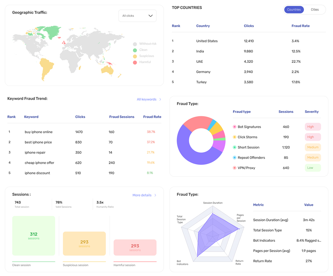
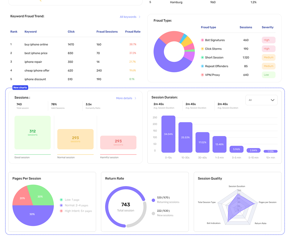
Built a data hierarchy framework that maps fraud signal complexity to the right presentation layer — charts for trends, tables for evidence, tooltips for definitions, filters for exploration.
02

The Dual-View Toggle

Problem

Amateur and advanced users need different interfaces — but building two separate products wasn't the answer.

Insight

One user preference should adapt the entire dashboard, not just a section of it.

Solution

Profile-level view toggle that adapts the entire dashboard: charts simplify, tooltips expand, table columns increase, filter controls deepen — all based on one user preference.

03

Three User Journeys, One Product

Problem

Trial users (beta invite), new self-serve users (landing page), and returning paid users all have different contexts and access levels.

Insight

Forcing one onboarding path onto three user types causes friction for all of them.

Solution

Designed three distinct onboarding journeys converging into a single product — each path acknowledges the user's context before asking anything of them.

04

The Evidence Chain

Problem

Competitors tell users a session was fraudulent. Users can't act on a verdict without understanding why it was flagged.

Insight

Showing the evidence — not just the outcome — transforms the product from a black box into a transparent partner.

Solution

Designed the Session Detail drawer as a clear verdict: bot behavior patterns, click storm signatures, VPN/proxy flags, short session anomalies — structured as a readable chain, not a data dump.

05

Budget Protection as the Hero Metric

Problem

The product's value was framed in technical metrics users didn't immediately connect to their business.

Insight

The real value isn't fraud detection — it's money saved. Fraudulent sessions × average CPC = real dollars.

Solution

Made business impact the single most prominent number. This design decision transformed the product's value proposition from technical tool to business protector.

Assets
Site Map19 pages
User Panel
Sign In / Up
Forgot Password
Welcome Modalmodal
Wizard Onboardingcomponent
Dashboard
Action Feed
Campaigns
Campaign List
Single Campaign
Sessions
Keywords
Reports & Export
User Tracker
Account & Settings
Profile
Billing & Payments
Detection
Tracking Code
Connectionsnew-tab ↗
User Journeys3 entry points
trial/
self-serve/
returning/
abandoned
main / merged
trial/self-serve/returning/expiringexpiredpayment-failedsetup-incomplete
sign-up
account
welcome
email
panel
active
DASHBOARD
Normal
Normal
Advanced
Advanced

Dashboard — normal vs advanced mode

One profile-level preference reshapes the entire dashboard. Some users want it clean and scannable; others want the full picture — so advanced mode adds charts, deepens every tooltip, expands the tables, and opens up more filters. Same dashboard, sized to how much detail each user actually wants.

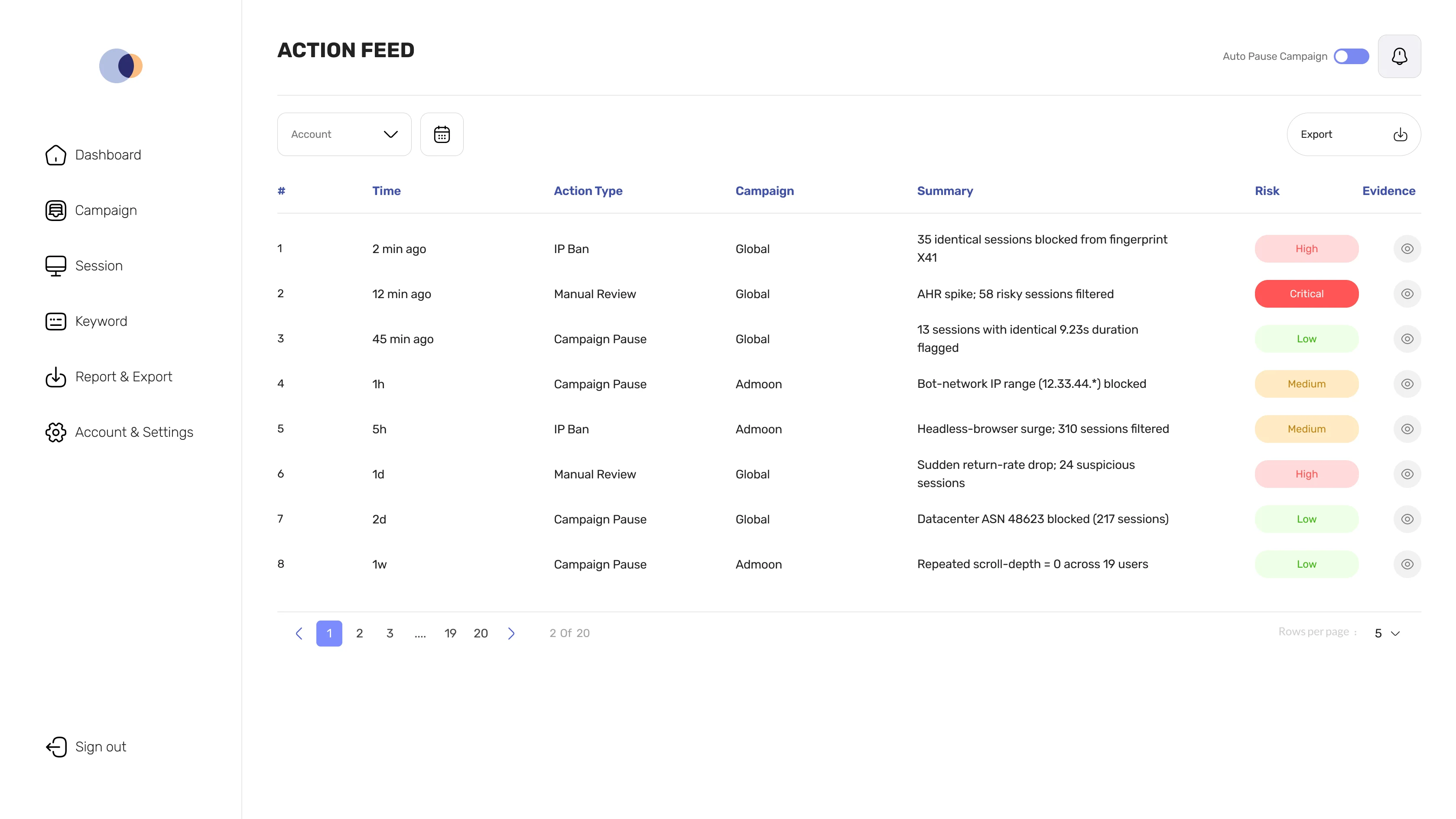
The action feed and its evidence drawer

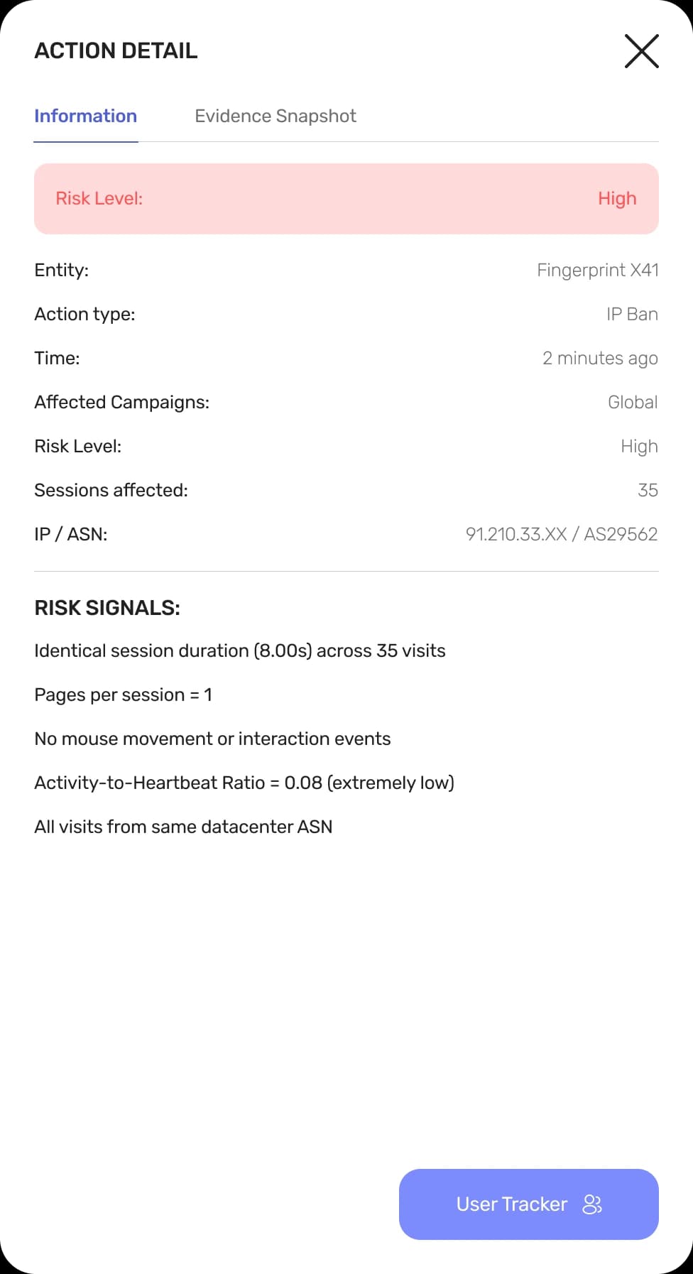
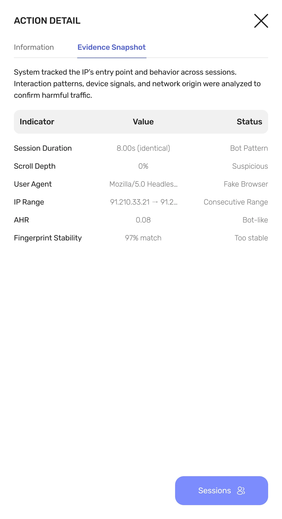
Every protective action — IP bans, campaign pauses, manual reviews — surfaces in a chronological feed. Click any row to open the evidence chain: risk signals, behavior patterns, and network anomalies, organized as a clear verdict instead of a raw data dump.

Hover to pause · click tabs to switch
Ciaro Action Feed
Drawer — Information tab
Drawer — Evidence Snapshot tab
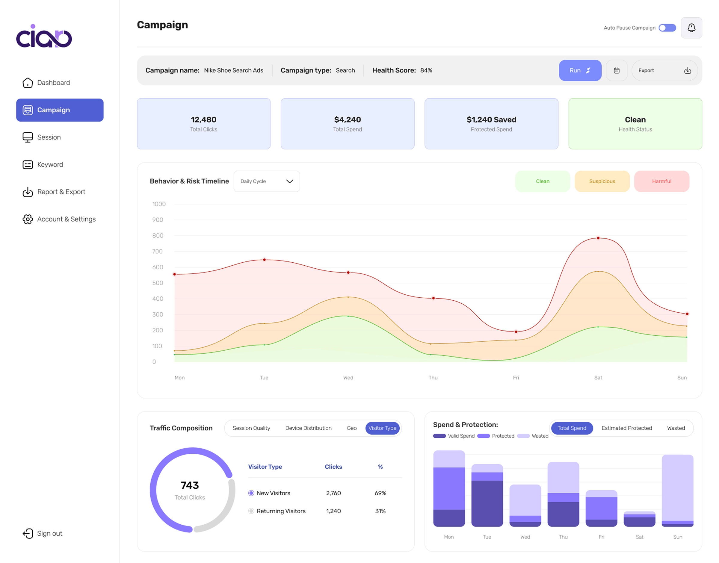
Spend and Protection chart showing budget protected from fraudulent traffic, with sessions and CPC as supporting metrics

Budget protection as the hero metric

The original chart led with fraudulent sessions blocked — a technical metric only the engineering team could love. I reframed it around budget protected: sessions × CPC = dollars saved. One calculation moved the product from technical tool to business case. The number a marketer takes to their CFO is the number that gets the renewal.

How an analyst reads a session

An analyst doesn't open one chart to assess traffic quality — they need to compare signals across pages per session, return rate, session health, duration patterns, and the funnel. The dashboard was built for that cross-referencing: every signal an analyst needs to judge a session, on one surface.

Ciaro session-analysis page — session KPI cards, pages-per-session and return-rate charts, a session-health breakdown, a behavior-versus-duration scatter, a traffic-quality funnel, and an all-sessions table with fraud scores and risk levels

Design System

An architecture for design, not a list of colors

Most design systems are lookup tables. This one is three layers: primitives never used by components, semantic tokens that re-bind on theme change, and component tokens that cascade automatically. Toggle the theme to see the architecture work — the components don't know dark mode exists.

THEME
01Primitivesraw values, theme-agnostic
?
find the chainB
primary
#4A57D4
success
#4CAF50
warning
#F9A825
neutral
#717171

These values never change. Components never reference them directly.

02Semanticintent-based, theme-aware
PRIMITIVE
SEMANTIC
COMPONENT
insight-500
#4A57D4
--action-primary
dark:insight-400#616BD9
light:insight-500#4A57D4
Save
neutral-0
#FFFFFF
--bg-surface
dark:neutral-900#18181B
light:neutral-0#FFFFFF
neutral-900
#18181B
--text-primary
dark:neutral-50#FAFAFA
light:neutral-900#18181B
Body text

Primitives stay locked. Semantic tokens resolve differently per theme. Components only know component tokens.

03Componentlocked to one component, inherits from semantic
Button — 5 sizes × 4 states

Different style per size. Hover any button to see its spec.

Disabled
Enabled
Hovered
Pressed
X SmallConfirm
h: 30px
pad: 6px · 12px
fs: 12px
h: 30px
pad: 6px · 12px
fs: 12px
h: 30px
pad: 6px · 12px
fs: 12px
h: 30px
pad: 6px · 12px
fs: 12px
SmallText
h: 35px
pad: 9px · 14px
fs: 13px
h: 35px
pad: 9px · 14px
fs: 13px
h: 35px
pad: 9px · 14px
fs: 13px
h: 35px
pad: 9px · 14px
fs: 13px
MediumSecondary Outline
h: 40px
pad: 12px · 20px
fs: 14px
h: 40px
pad: 12px · 20px
fs: 14px
h: 40px
pad: 12px · 20px
fs: 14px
h: 40px
pad: 12px · 20px
fs: 14px
LargeOutline
h: 50px
pad: 16px · 24px
fs: 16px
h: 50px
pad: 16px · 24px
fs: 16px
h: 50px
pad: 16px · 24px
fs: 16px
h: 50px
pad: 16px · 24px
fs: 16px
X LargeFilled
h: 56px
pad: 18px · 28px
fs: 18px
h: 56px
pad: 18px · 28px
fs: 18px
h: 56px
pad: 18px · 28px
fs: 18px
h: 56px
pad: 18px · 28px
fs: 18px

+ 4 more styles available: Secondary Filled, Confirm-Outline, Cancel, Cancel-Outline.

Type Scale

Rubik. Tabular numerics for KPIs and tables.

text-displayDisplay heading40/48 · 700 · -0.02em
text-h1Page title28/36 · 700 · -0.01em
text-h2Section title22/30 · 600 · -0.01em
text-h3Card title18/26 · 600 · 0
text-bodyDefault body text14/20 · 400 · 0
text-captionKPI sub-text12/16 · 500 · 0.01em
text-mono192.168.1.113/20 · 400 · 0

Components only know component tokens. Theme changes cascade through the architecture automatically.