01
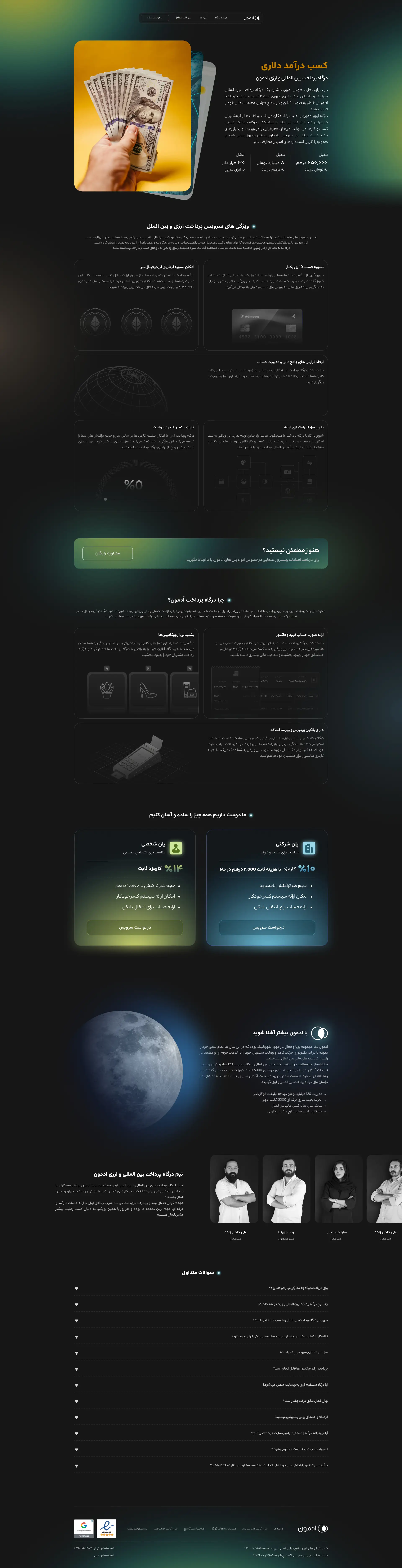
Bento Grid as Visual Language
The bento grid wasn't chosen for aesthetics — it was chosen because it lets different types of content sit at different weights without hierarchy becoming noise. Feature cards, metric callouts, comparison blocks, and social proof could coexist in the same visual space without fighting for attention. Each cell was designed as a standalone proof point so users could read the page in any order and still understand the value.