WHAT I LEARNED → WHAT I BUILT
Target age 24–45
Mid-complexity UI — not over-simplified, not expert-level
~55% buy on web, not app
Phase 1 is web-first; app is Phase 2+
Users are reasonably tech-familiar
No heavy onboarding or tutorials
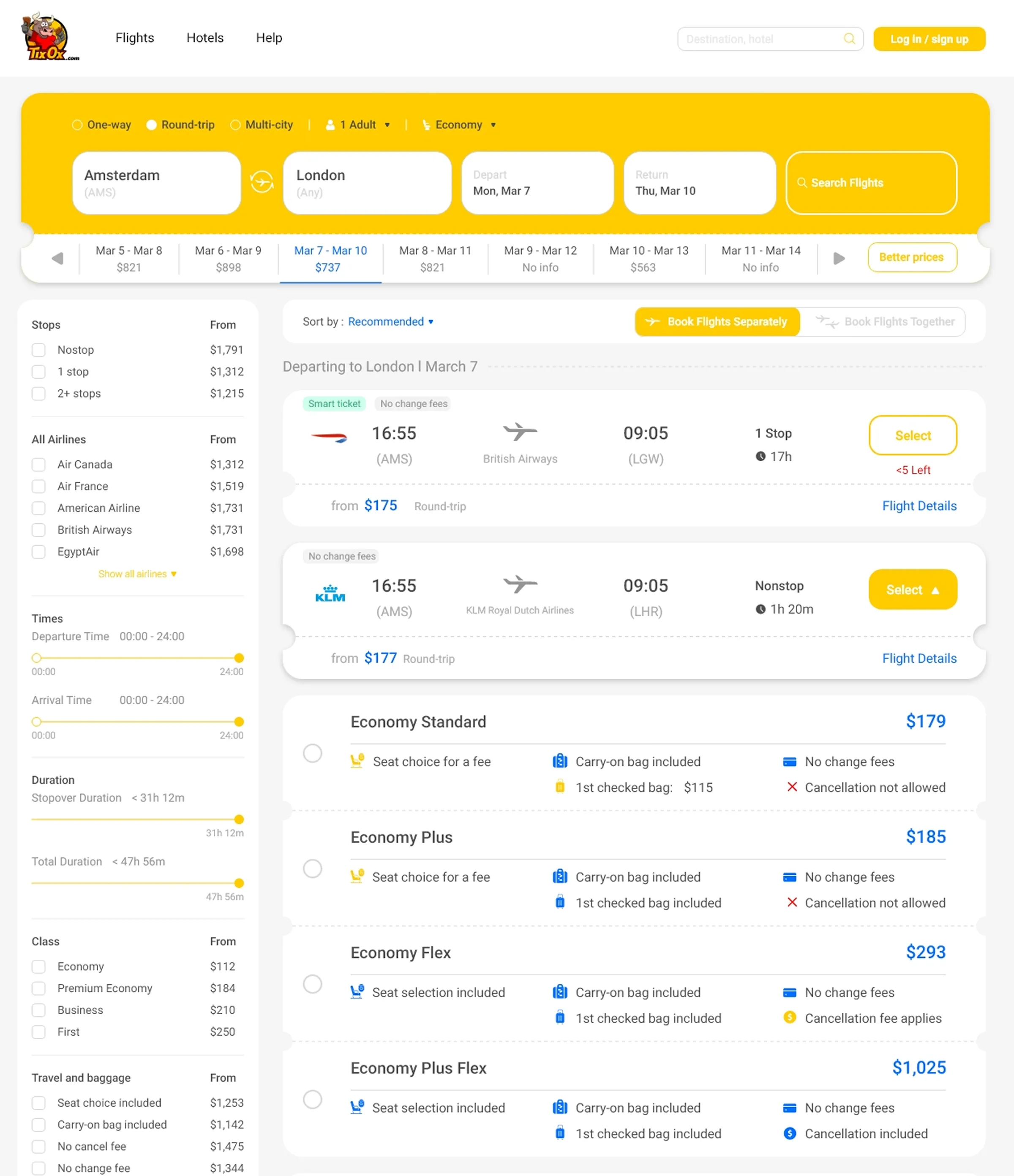
Most look for one-way tickets
Default search mode: one-way
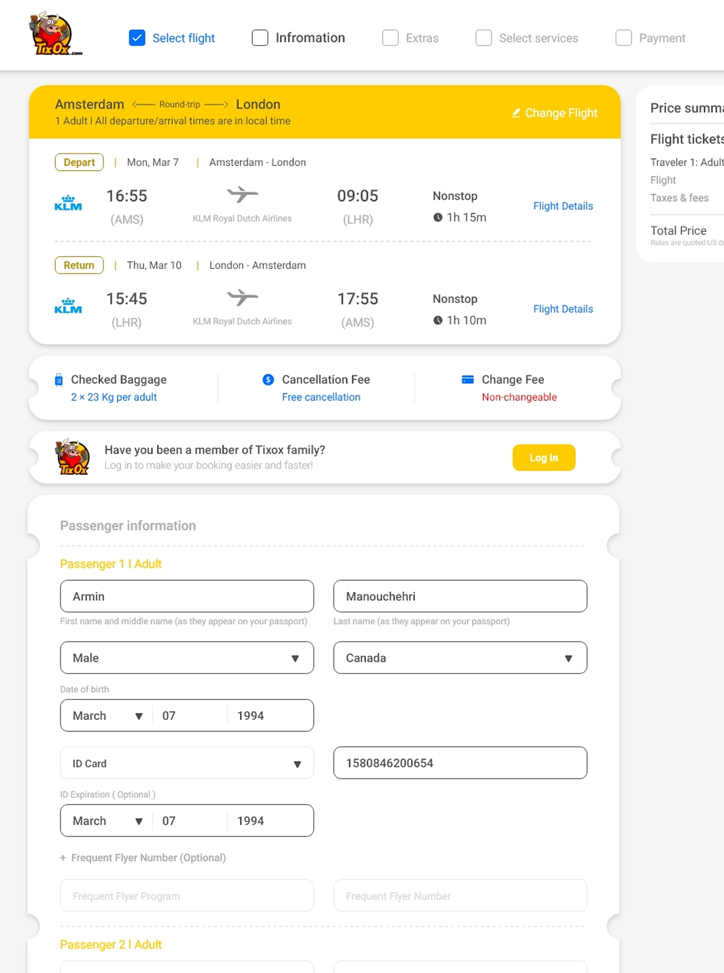
Users want purchase done fast
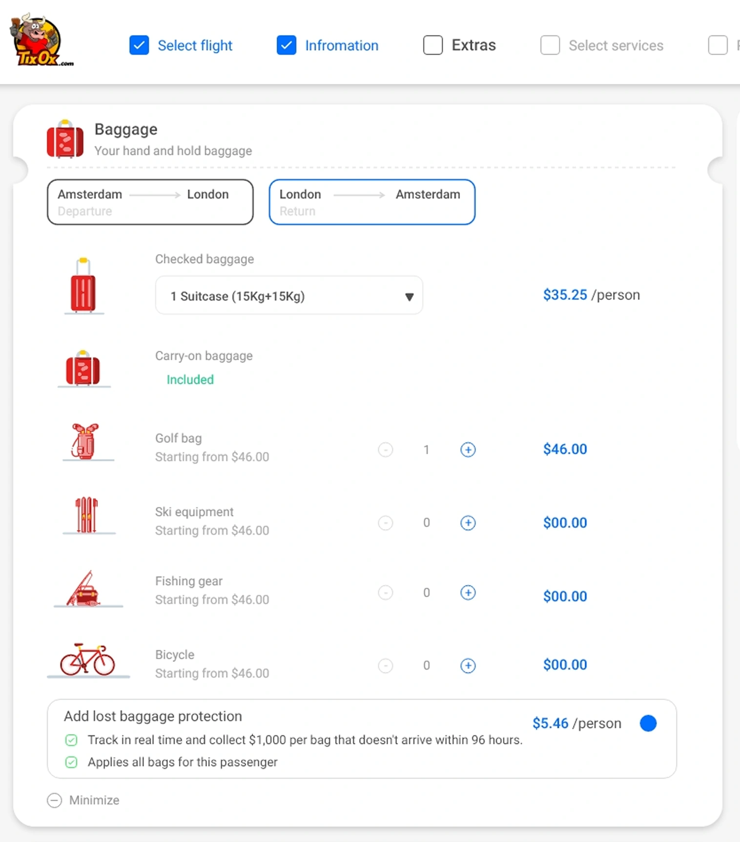
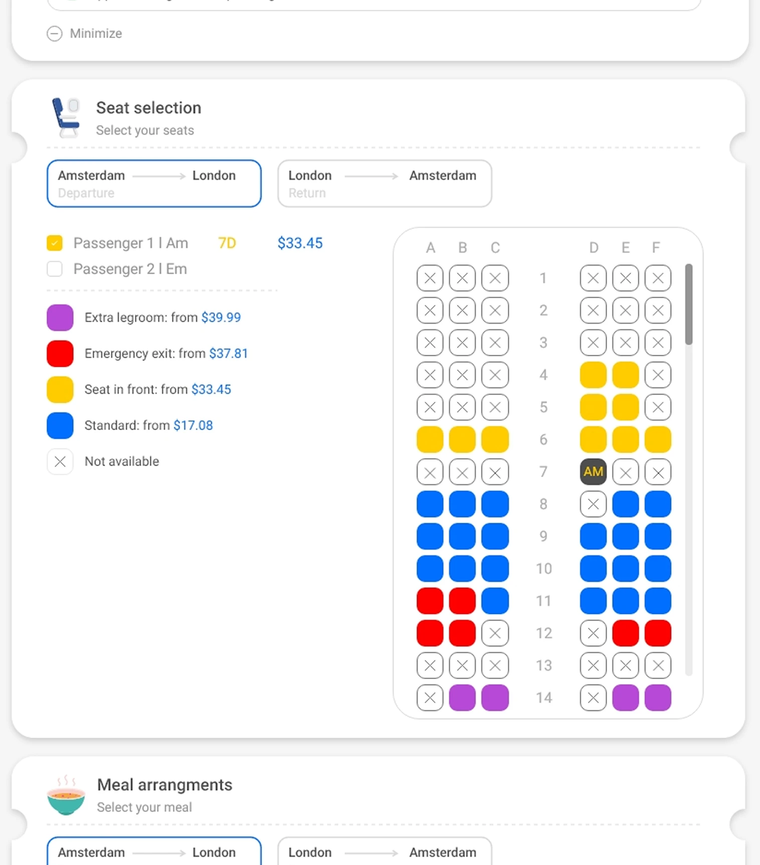
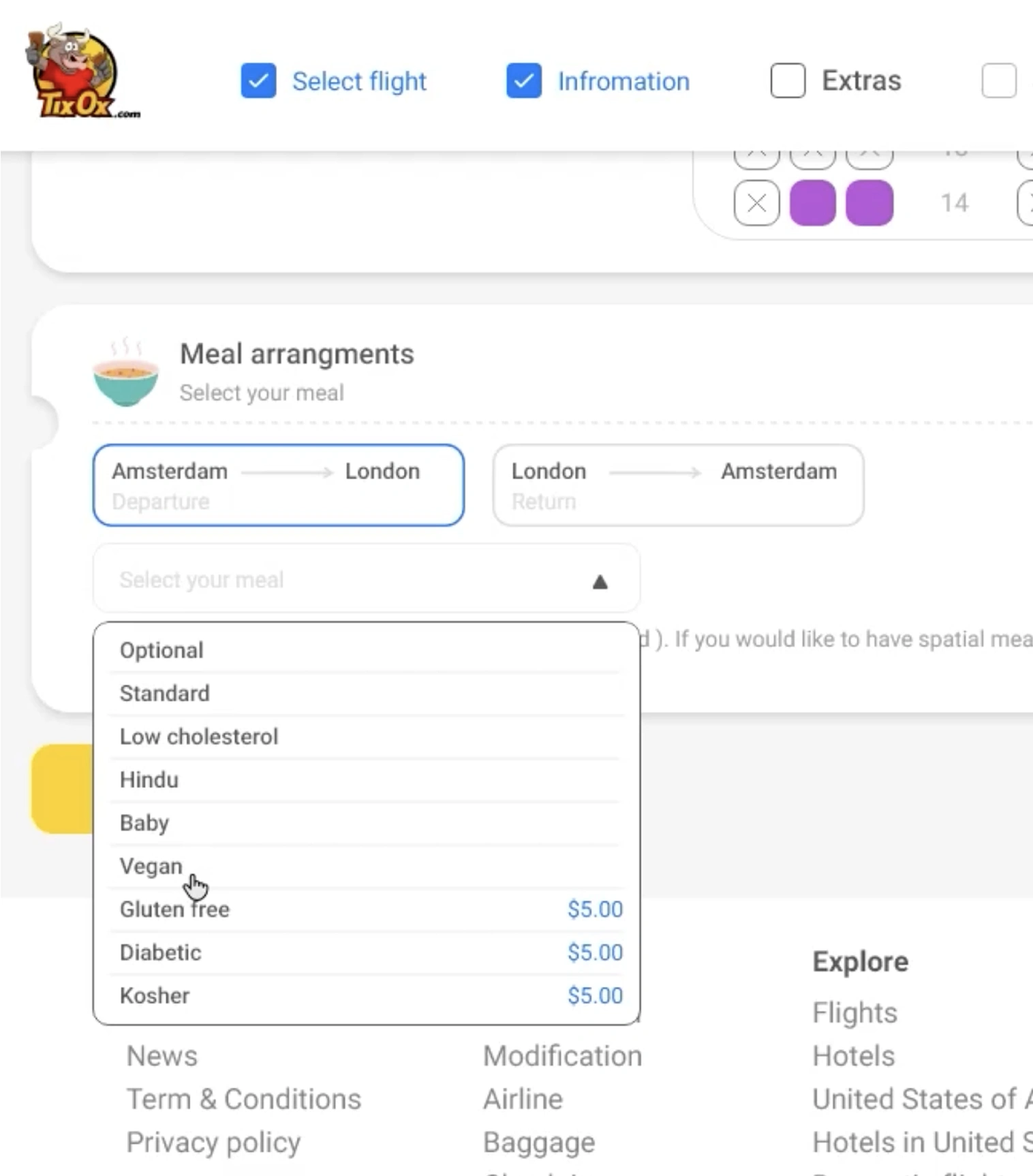
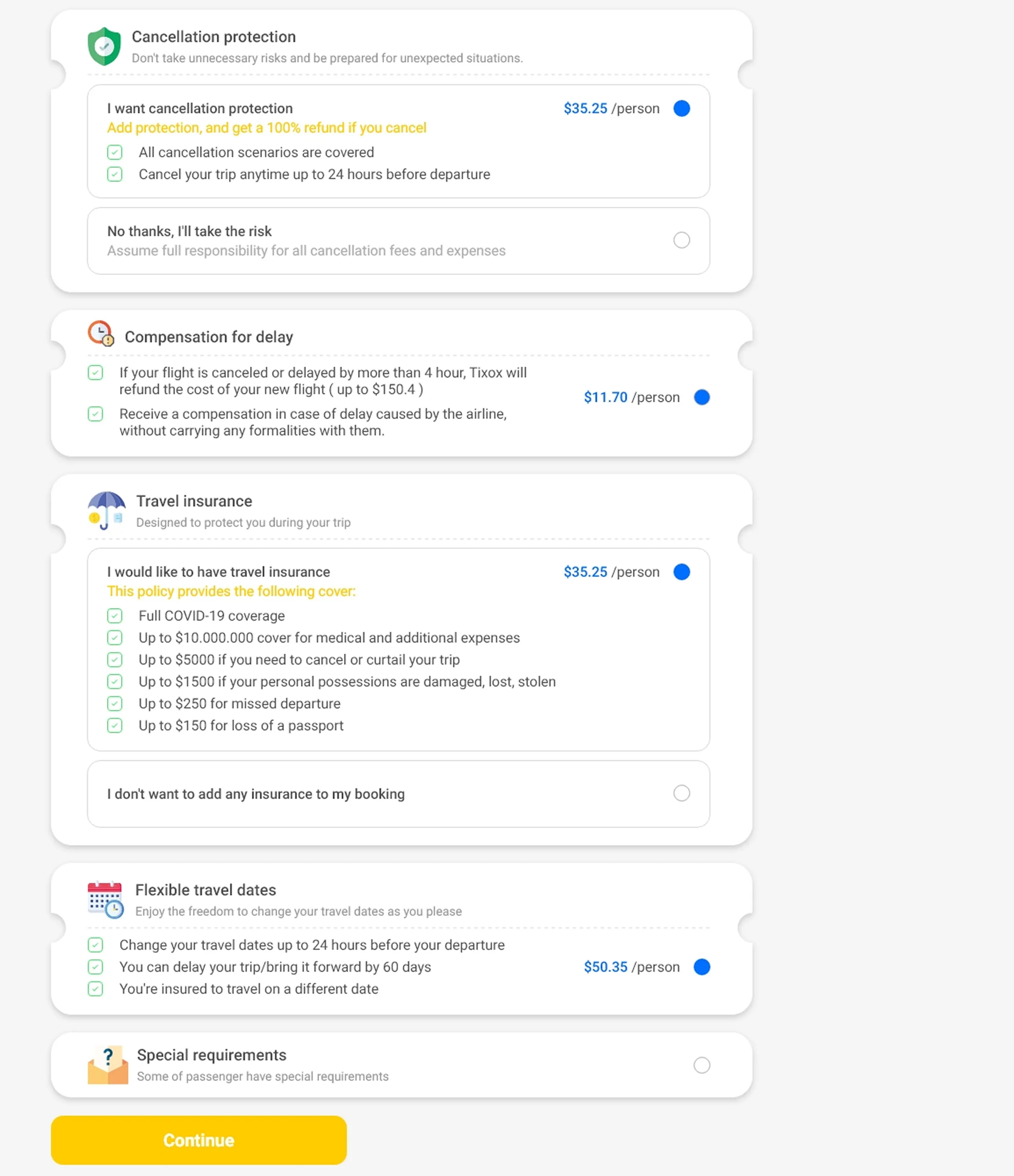
Minimize required steps; skip buttons on optional services
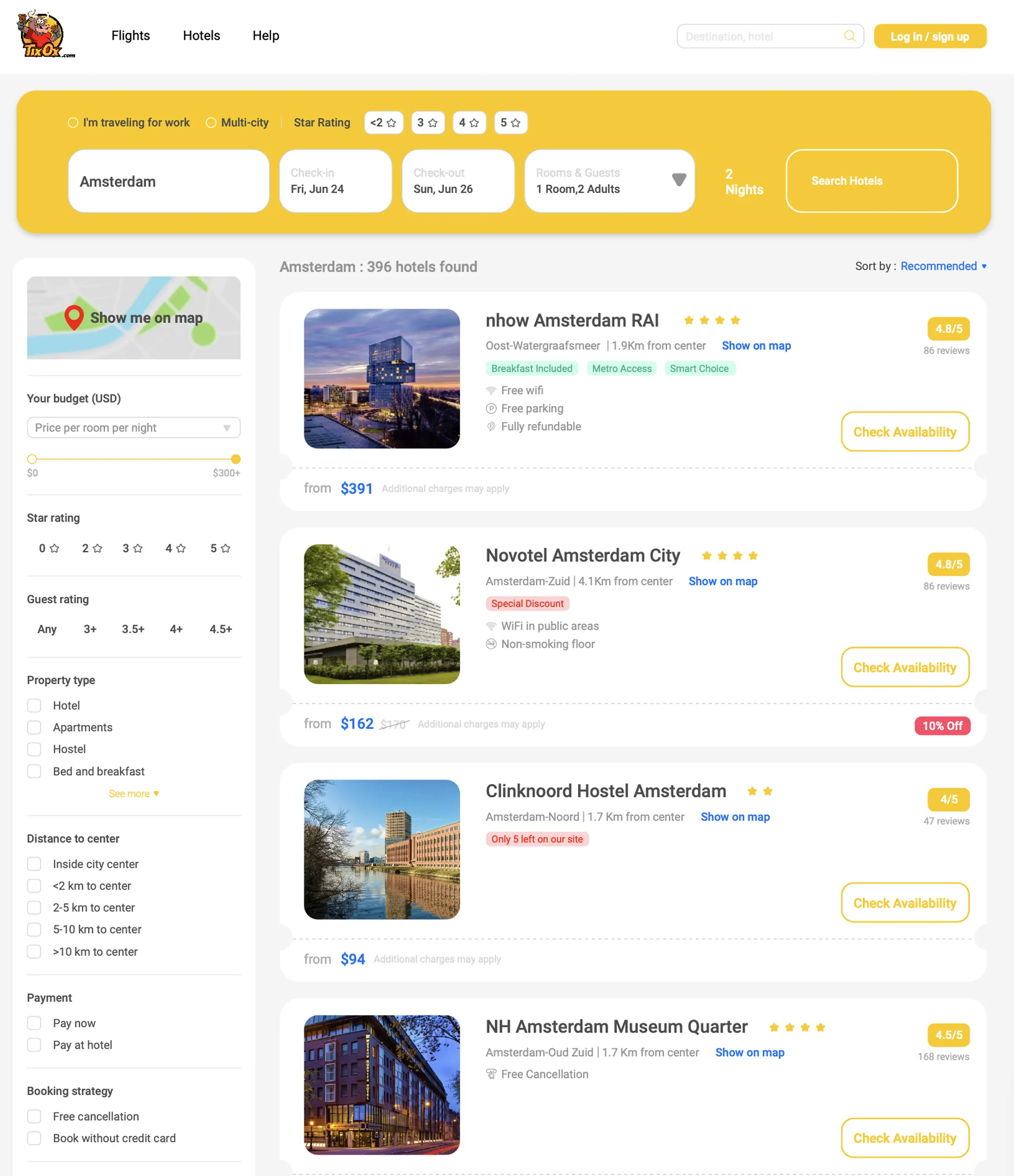
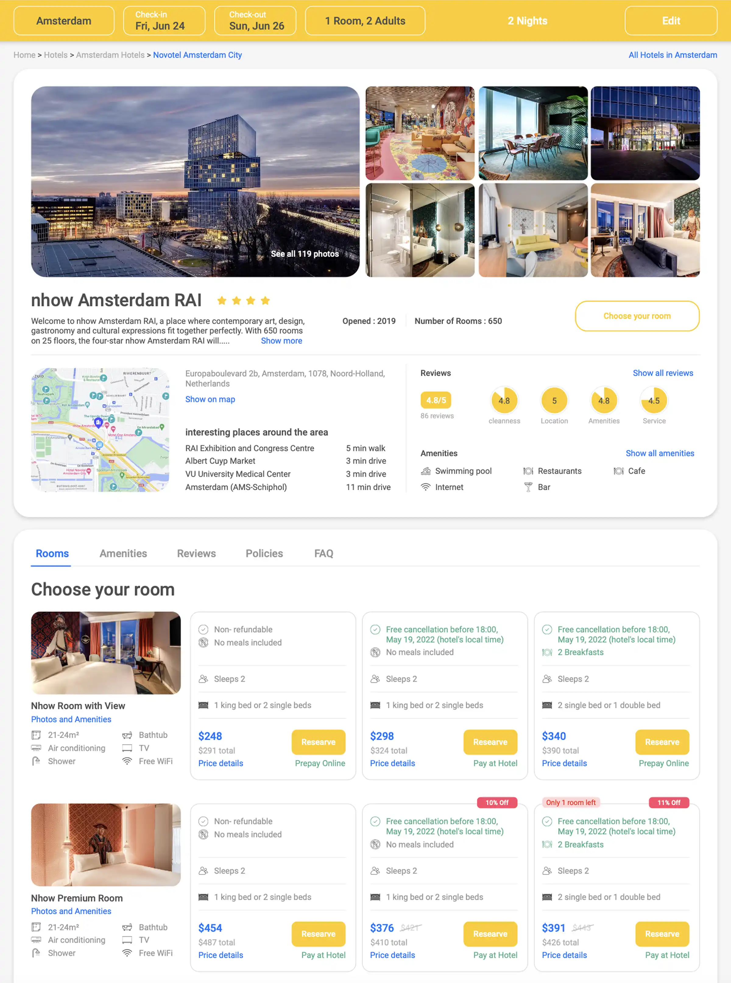
Too many choices creates fatigue
Progressive reveal — options in stages, not all at once
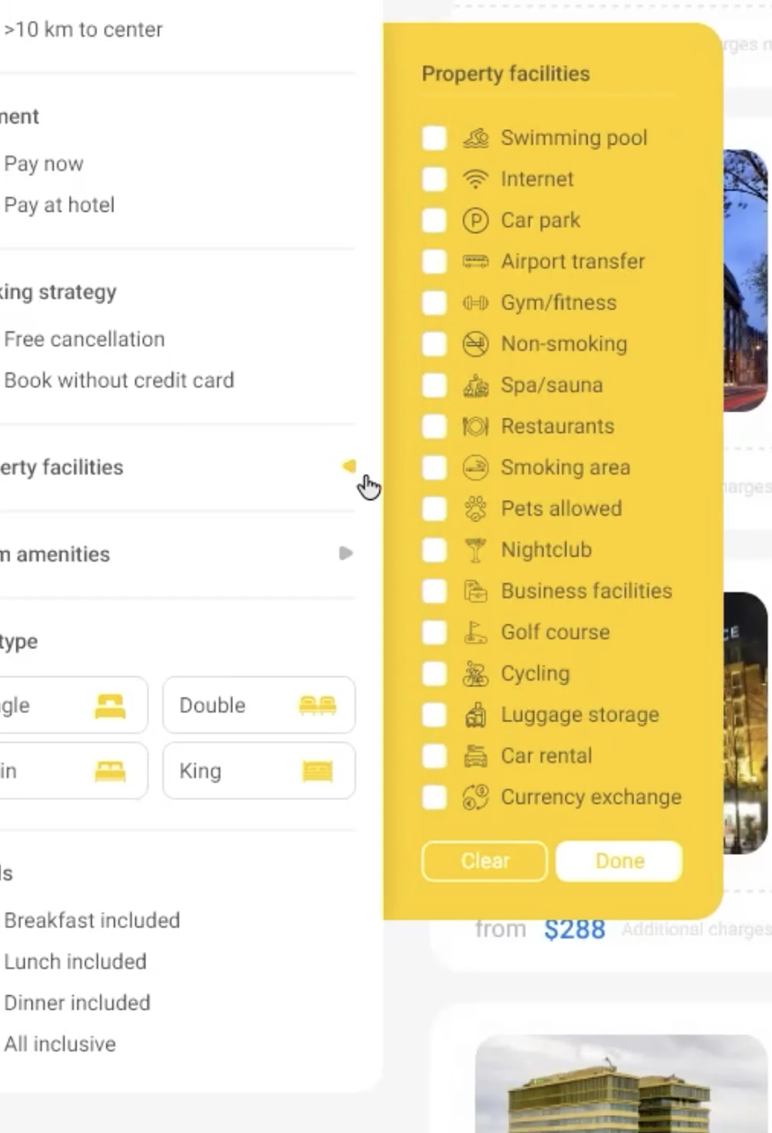
Users want to pre-filter before results load
Filters in the search bar, not just results page
Users want price preview before navigating
Show prices in results without page load
Round-trip: most don't select separately, but many will to save
Support both "package" and "select separately"
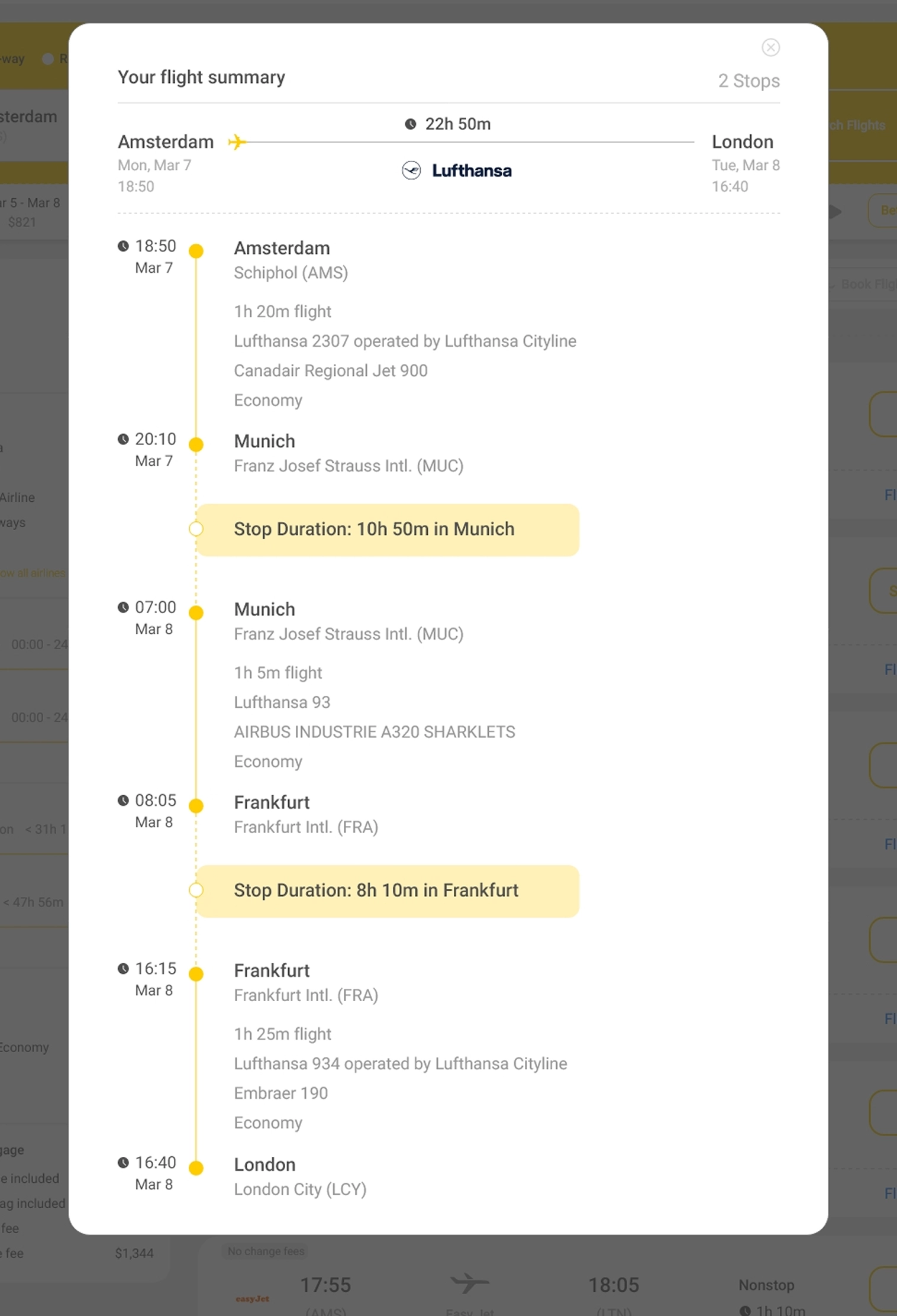
Priorities beyond price: facilities, discounts, time, stops, summary
All visible on the ticket card without opening detail
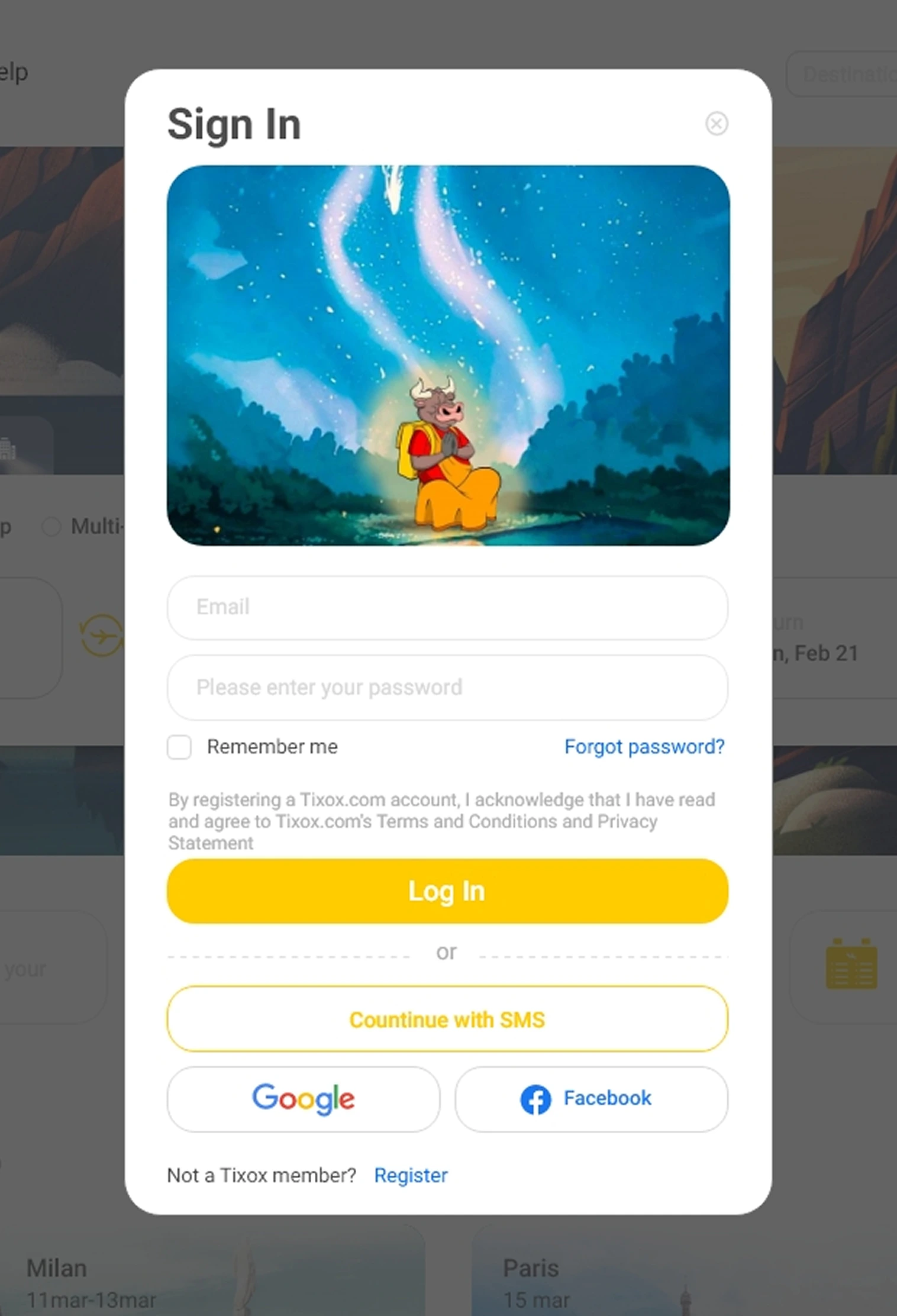
Most prefer email for flight info
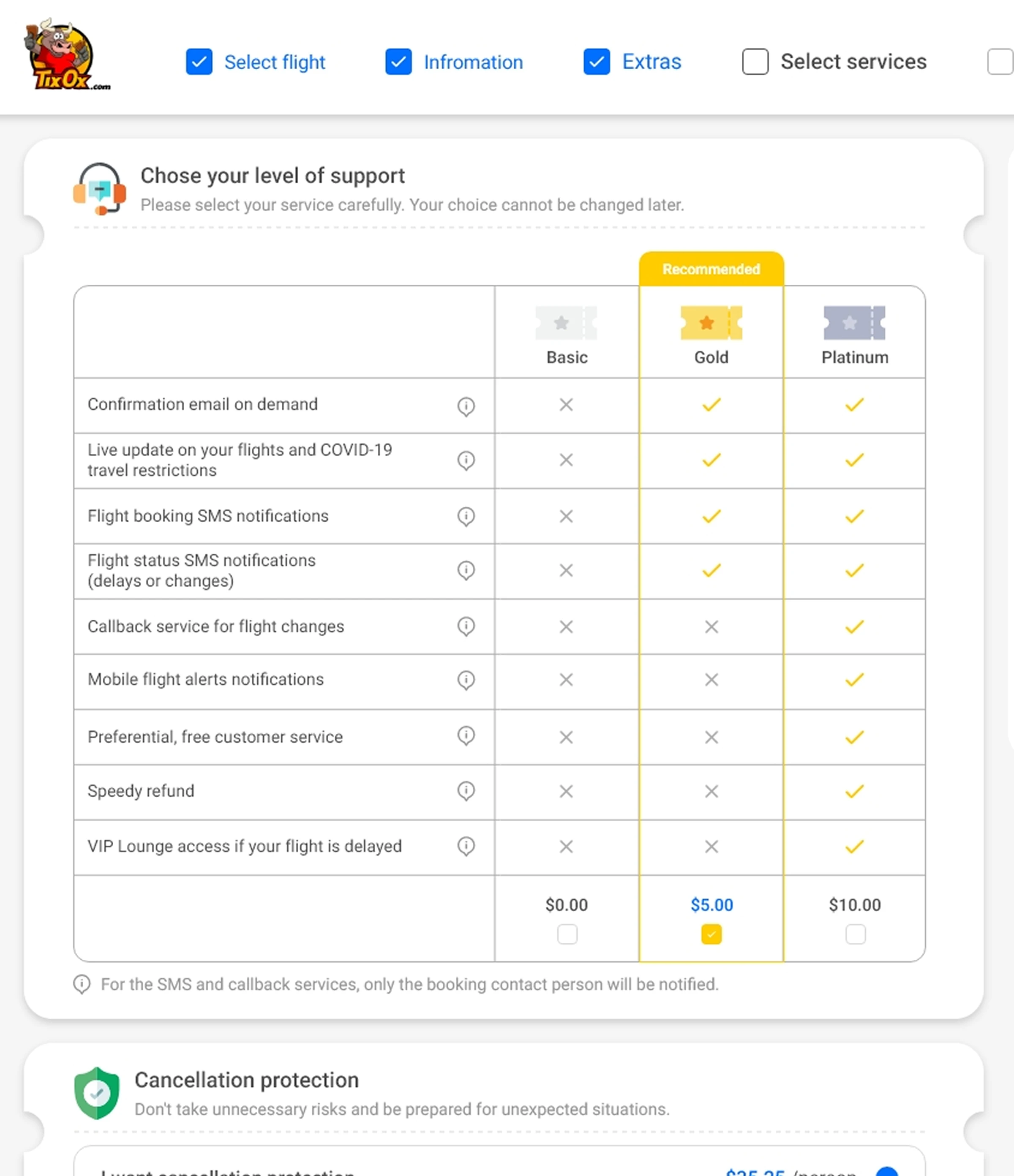
Email confirmations primary; SMS optional
Many have time constraints
Clear "Skip" on the services step
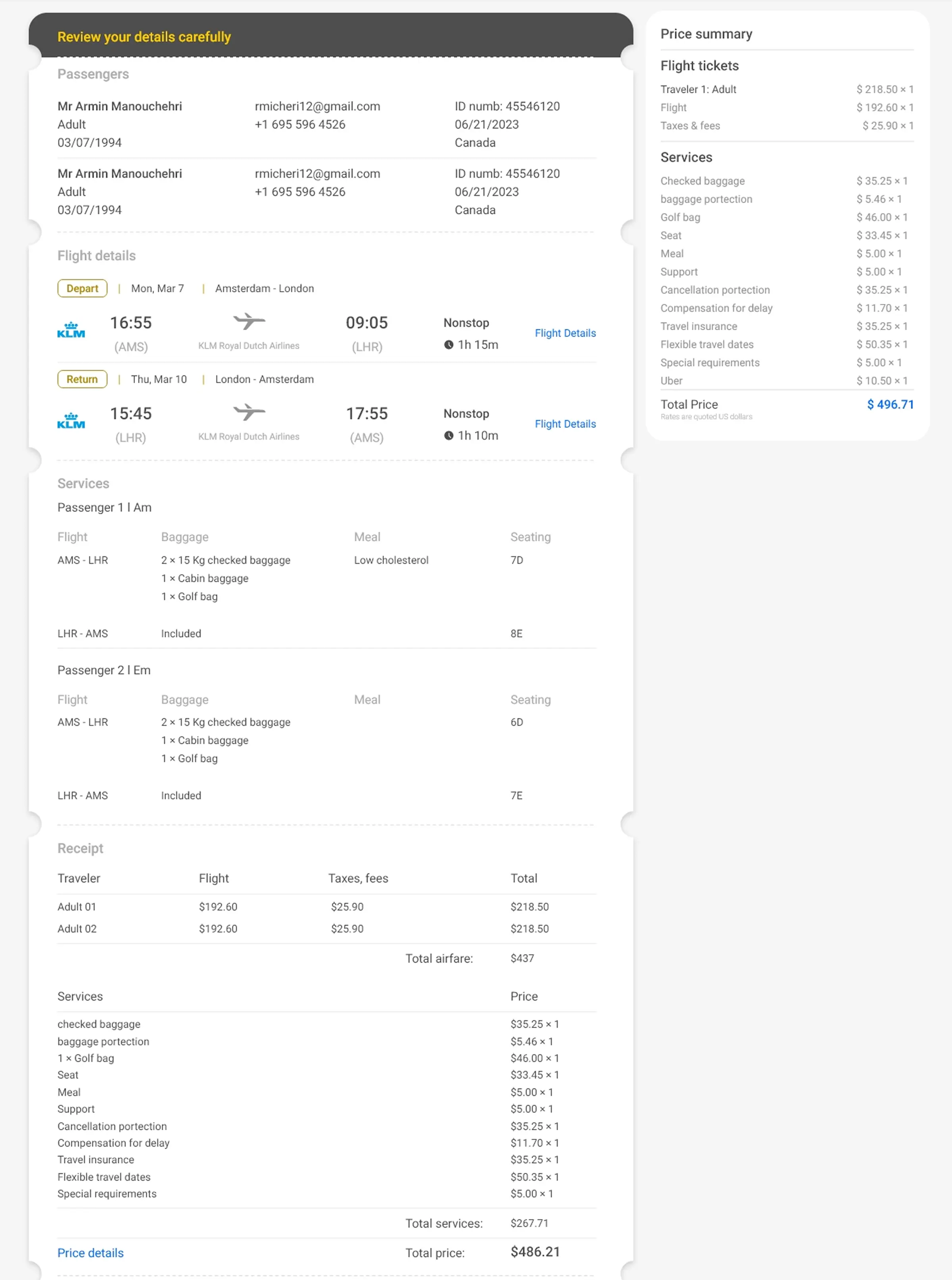
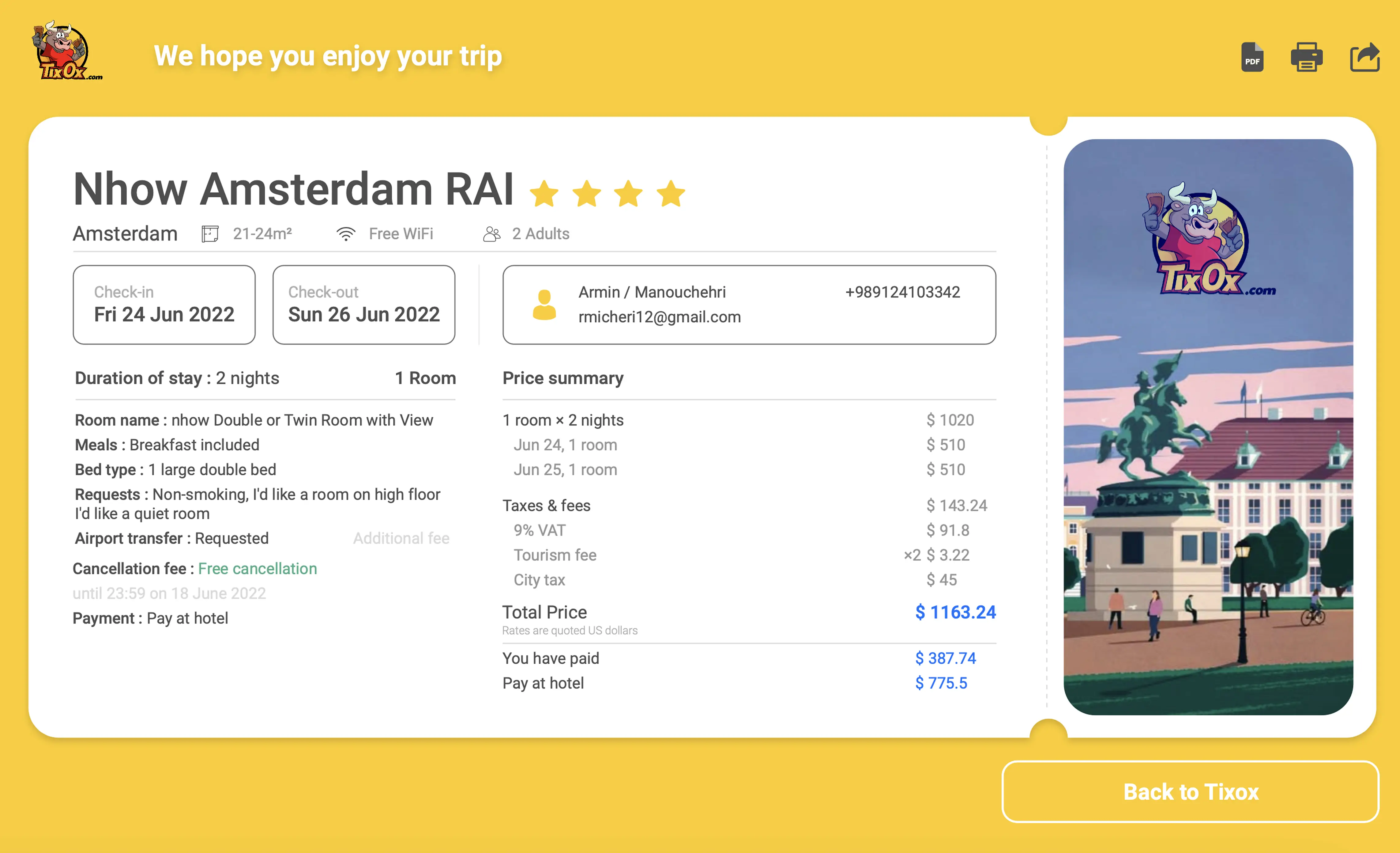
Most don't read final details, but legally must see them
Show required info, designed for scanability
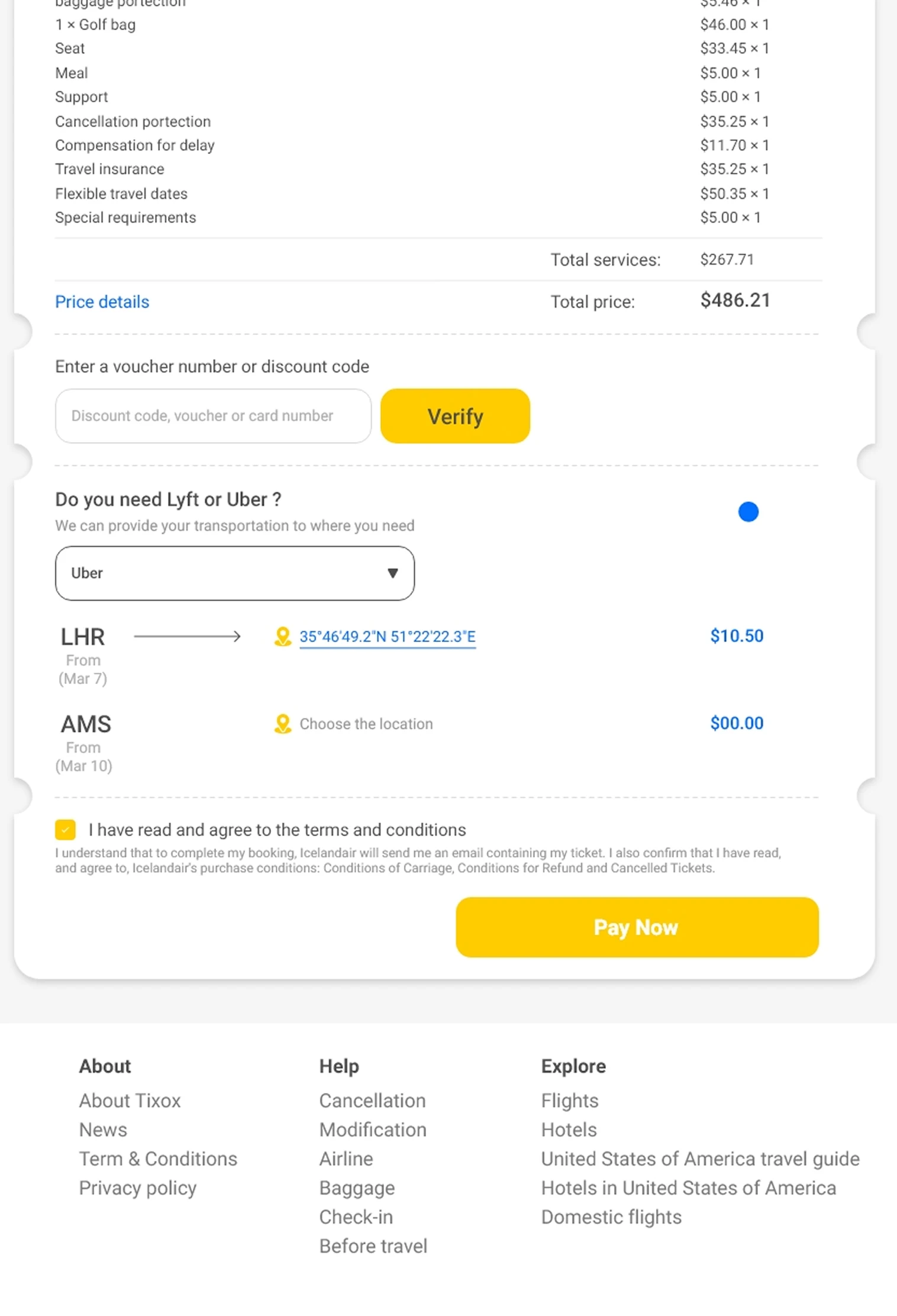
Most don't want to pay for transport, some do
Transport placed at the end, optional, not pushed
Younger users want modern payment
Support digital wallets + Google Pay alongside cards
Every decision above traces to a finding — research wasn't a phase, it was the blueprint.